Jan 2019
Student Org Discovery App
Overview
This is a mobile app for students to discover and propose student organizations.
I designed this as a response to Google's 7-day design challenge, where I was given a prompt to design an experience around, with a wireframe flow and a couple high fidelity screens.
I designed this as a response to Google's 7-day design challenge, where I was given a prompt to design an experience around, with a wireframe flow and a couple high fidelity screens.
Prompt
Google provided three prompts for this challenge, and I chose the one below:
A new school year is approaching!
Design an experience for new students to browse, search, and propose new student organizations.
Research
To get a better understanding of the situation and how to design the best fitting solution, I started by
sending out a preliminary user questionnaire and checking out existing solutions.
Questionnaire
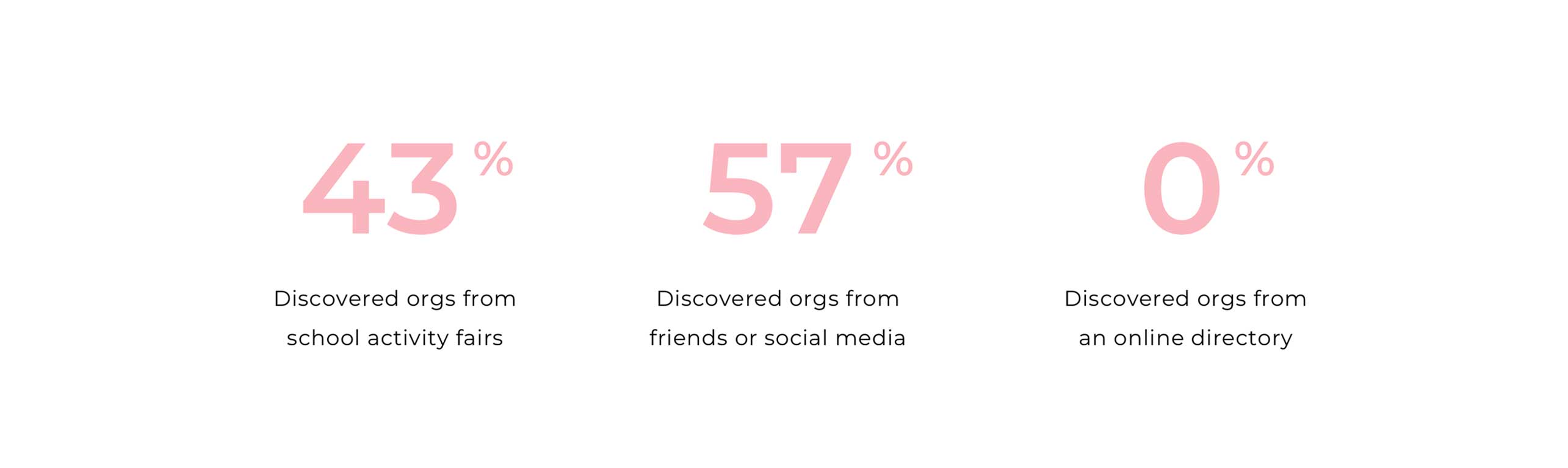
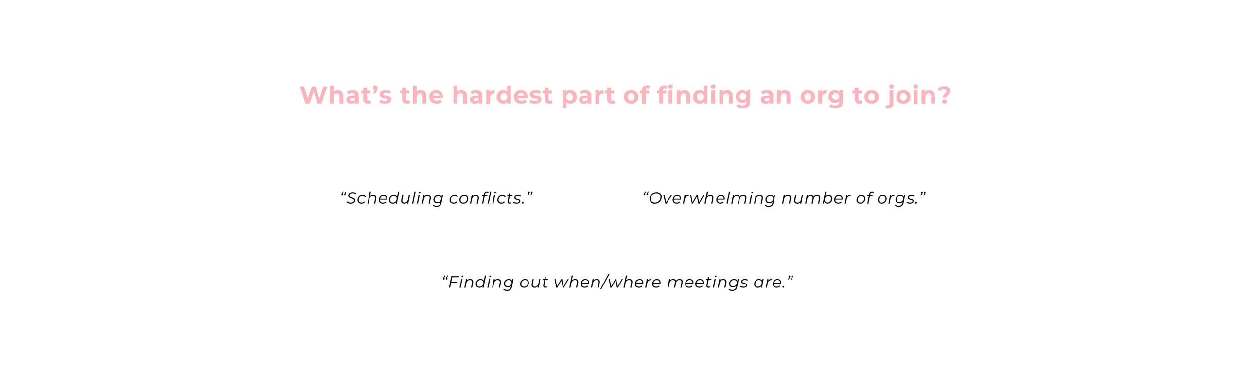
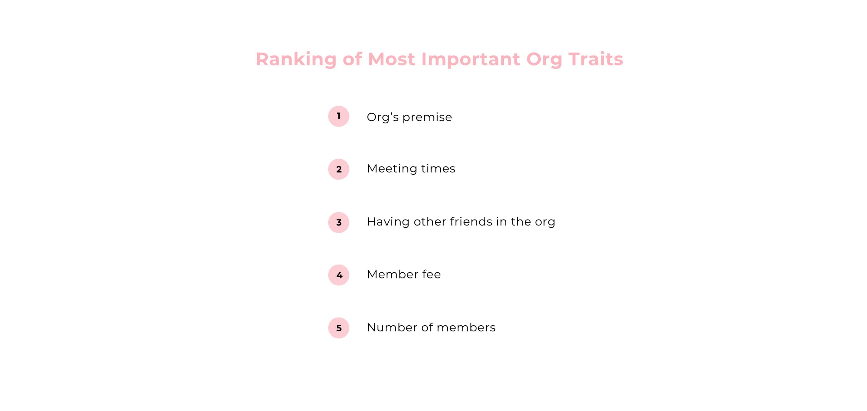
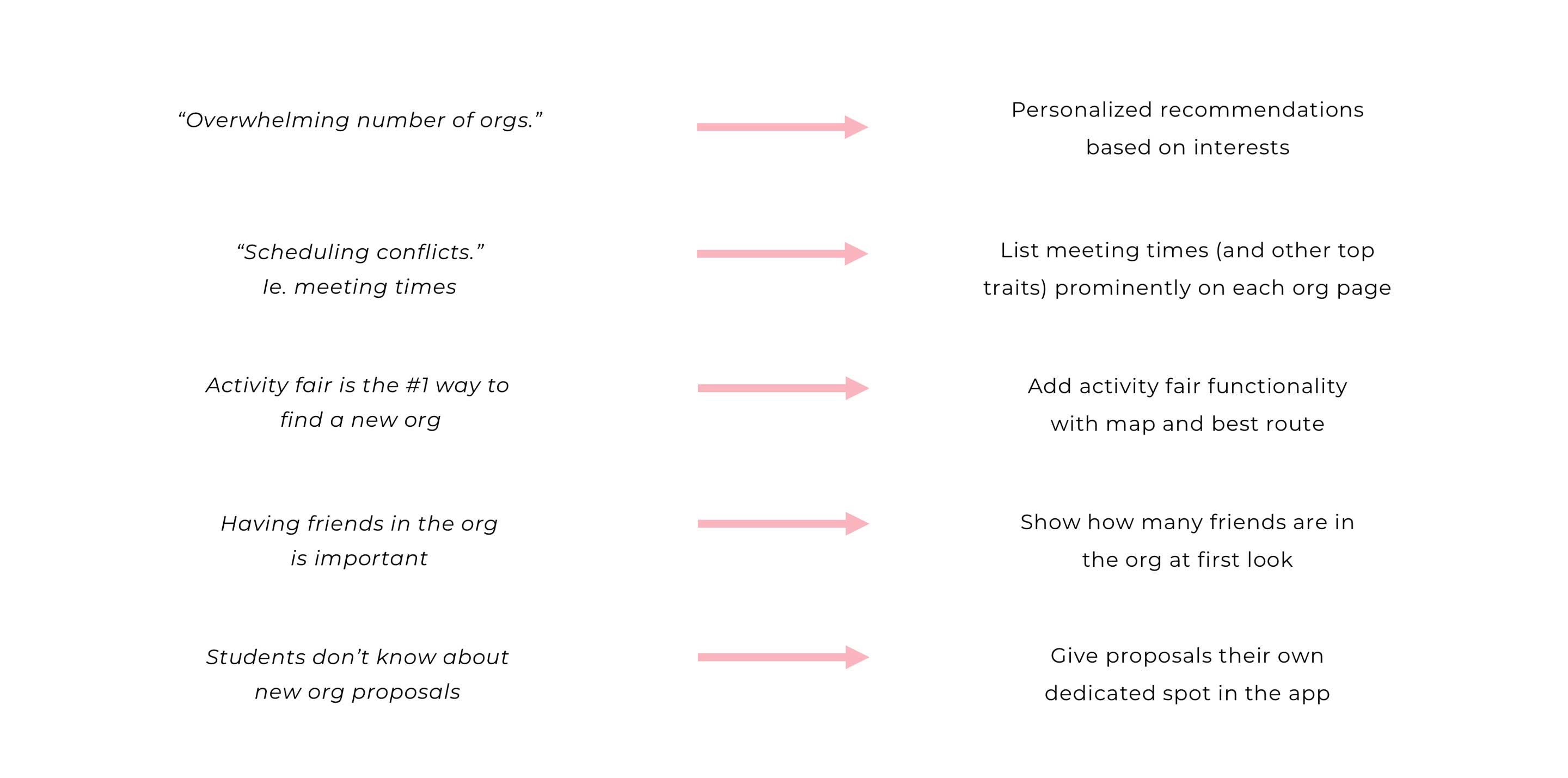
In the questionnaire, I asked college students about their journey finding and joining student organizations. Below are some of the key findings:
For new student org proposals, the takeaways were a little different. Most students didn't know how to discover newly-proposed student orgs, and the trait ranking was different: the only two values students cared about for proposals were
the premise and how many other people were interested in the proposal.
Benchmarking
I couldn't look at other school's solutions since they required student login, so I focused my analysis on DukeGroups, our school's org directory. I found that you could search by org name or category of orgs, but aside from that, all each organization had was a short summary and a list of their exec board.
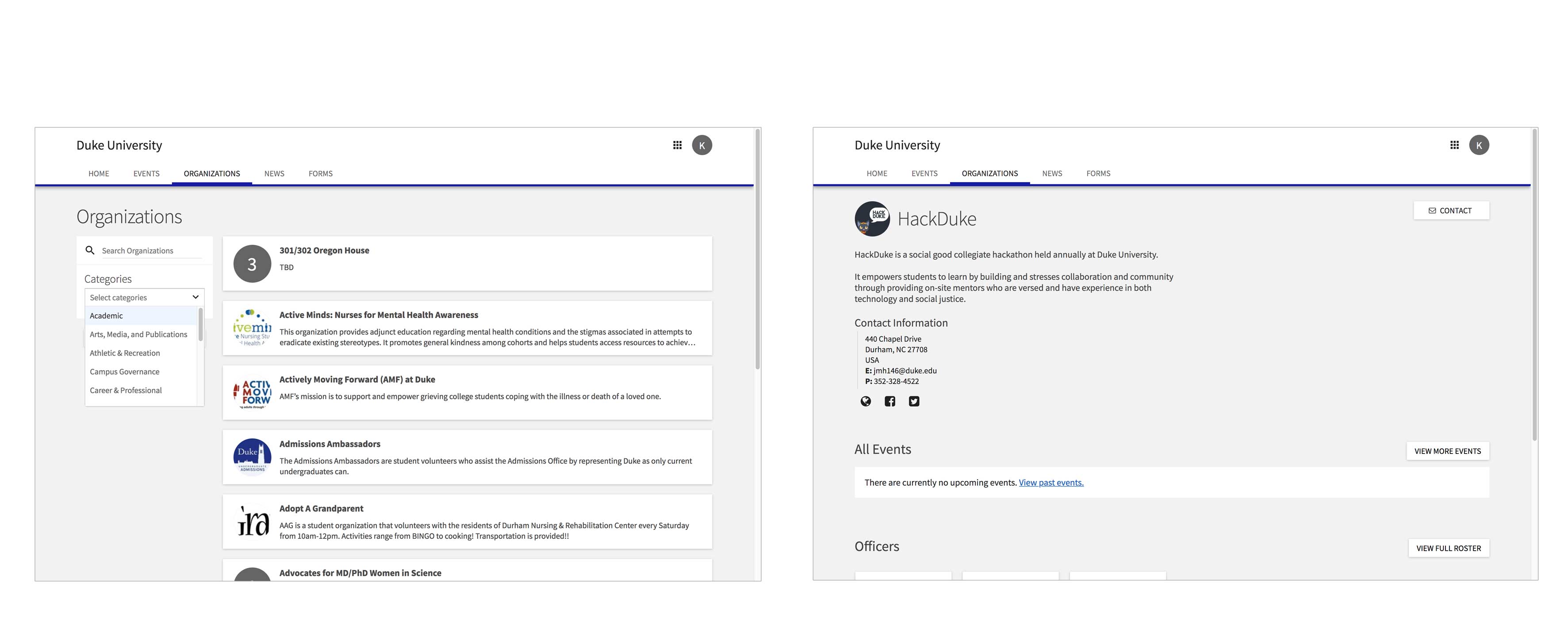
No wonder the user research above showed 0% used DukeGroups to find a new org! In follow up user interviews, I found that students didn't use it because
it only provided a description of the org without any other key information or functions,
as I would expect.
Addressing User Concerns
Next, I mapped my key user research takeaways from the questionnaire to features my new app could have to address them.
Ideation
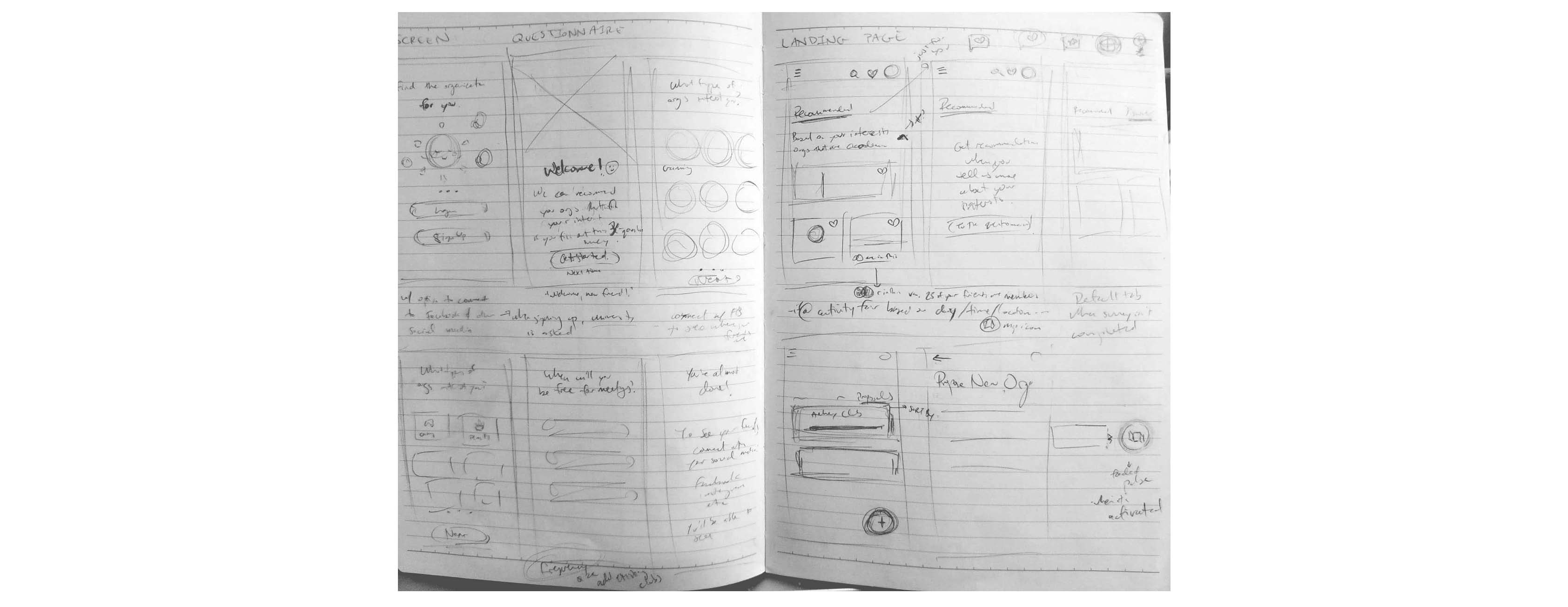
Sketching
I knew I wanted to design a mobile app because it would allow new students to search up orgs whenever they had a small bit of time, like on the bus to class, on their way to an org's first meeting, or at the activity fair.
I played with different layouts quickly by sketching out my ideas and scribbling notes. At this point, I focused on just getting any idea I had out on paper, which is why they're so messy! Here are a few pages out of many:
I played with different layouts quickly by sketching out my ideas and scribbling notes. At this point, I focused on just getting any idea I had out on paper, which is why they're so messy! Here are a few pages out of many:
User Flow

Click the image for full size.
In brief, the user flow is made up of
the sign up/preliminary survey and the main app with 4 tabs (Just for You, Discover, Proposals, Likes).
I'll go over the flow in more detail in the next section.
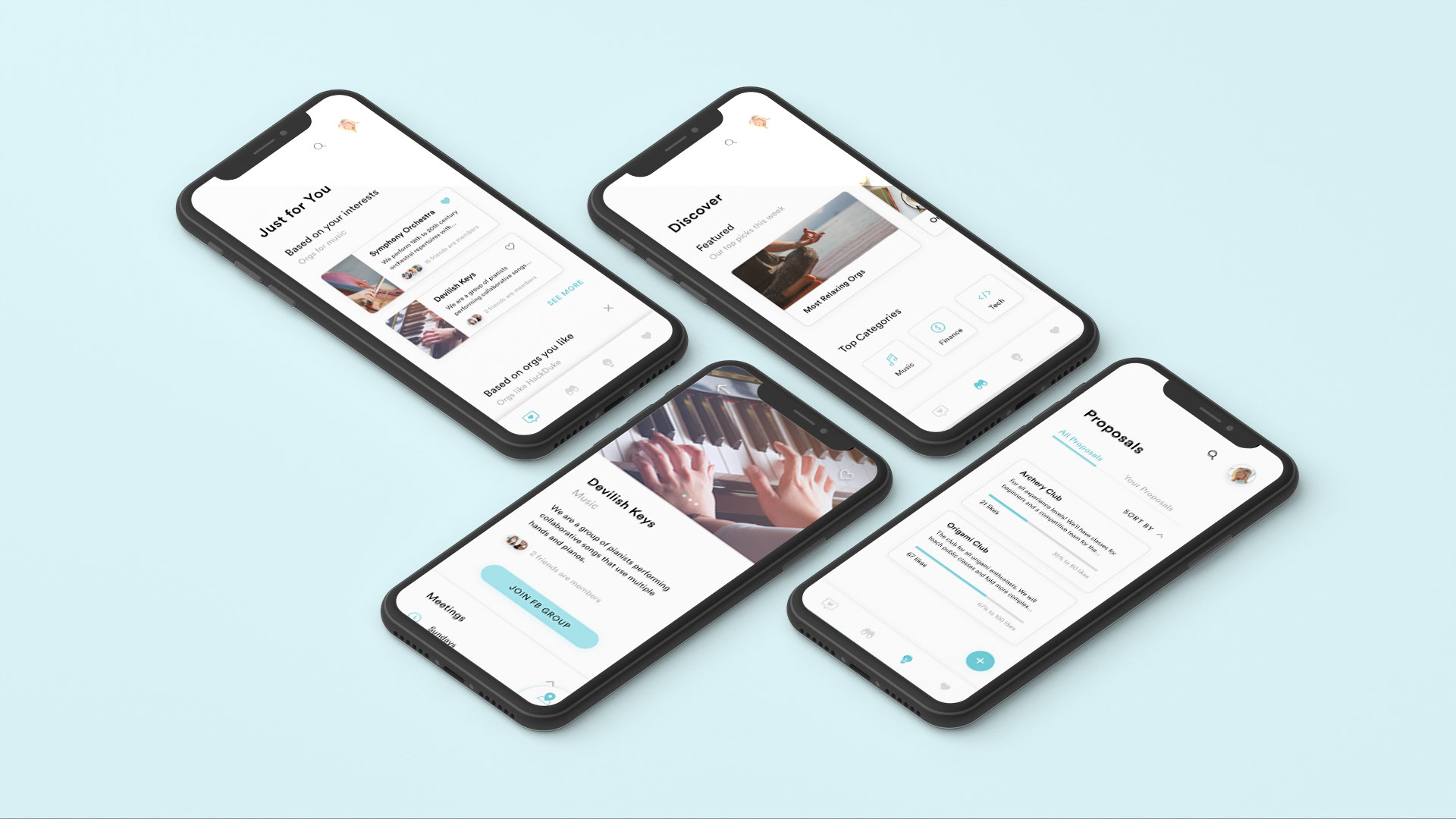
Final Designs

The app opens with the sign up/log in flow, starting with top user benefits. On sign up, users will fill out information like what school they go to, what clubs they're in already, and whether they'd like to connect their Facebook or other social media (unpictured).
Afterwards,
Afterwards,
users can take a preliminary survey that asks about their interests and aspects of their ideal org,
which will be used to inform the personalized recommendations in the Just for You tab.
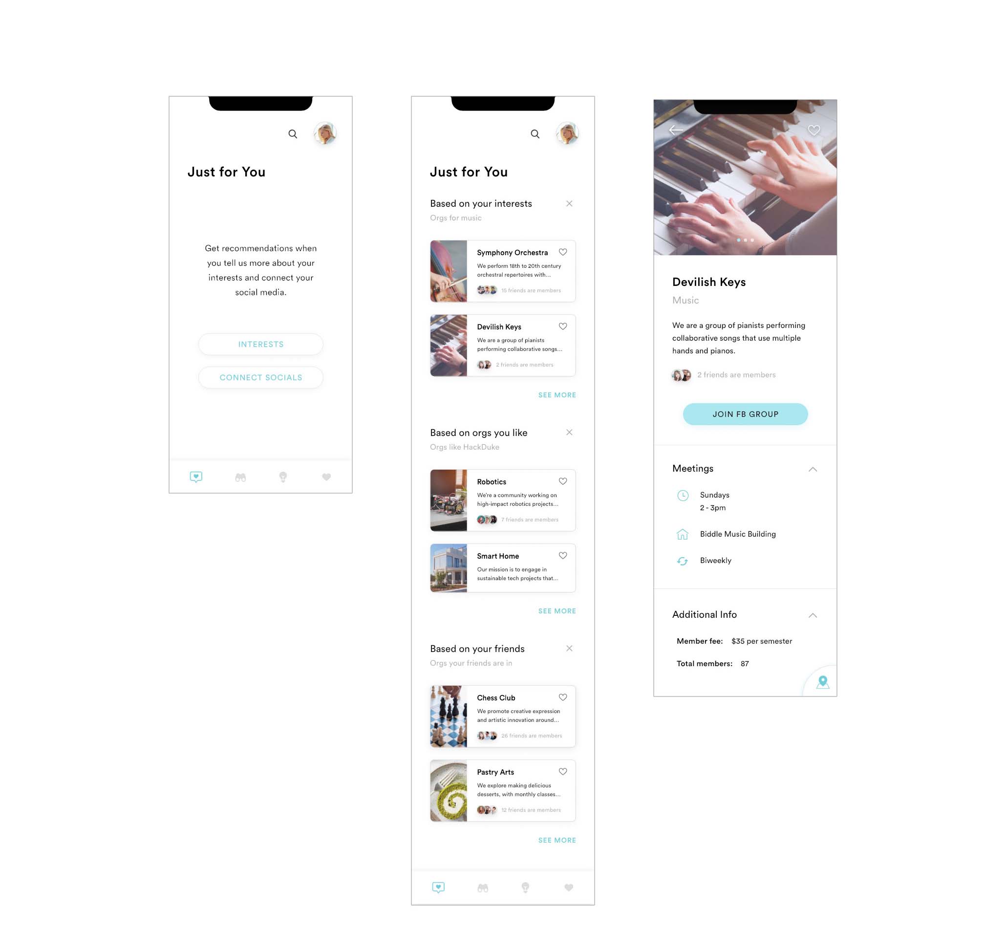
After finishing sign up, users are taken straight to the Just for You tab (unless they skipped it, and then they would be sent to the Discover tab, covered next, instead). For the users who skipped the survey, they'd be prompted to take it and/or connect their social media (if they didn't in sign up) in order to get recommendations here.
The Just for You tab provides different categories of recommendations with explanations on why these orgs are being recommended to you;
research papers show this increases user involvement & trust, plus it streamlines their experience! These recommendations are refreshed daily, and users can remove any sections they don't like.
The cards themselves show some of the most important traits for users to make a decision on whether to delve deeper according to the initial user research, and clicking on an org shows
all
the traits covered in the questionnaire.
These screens are fairly straightforward.
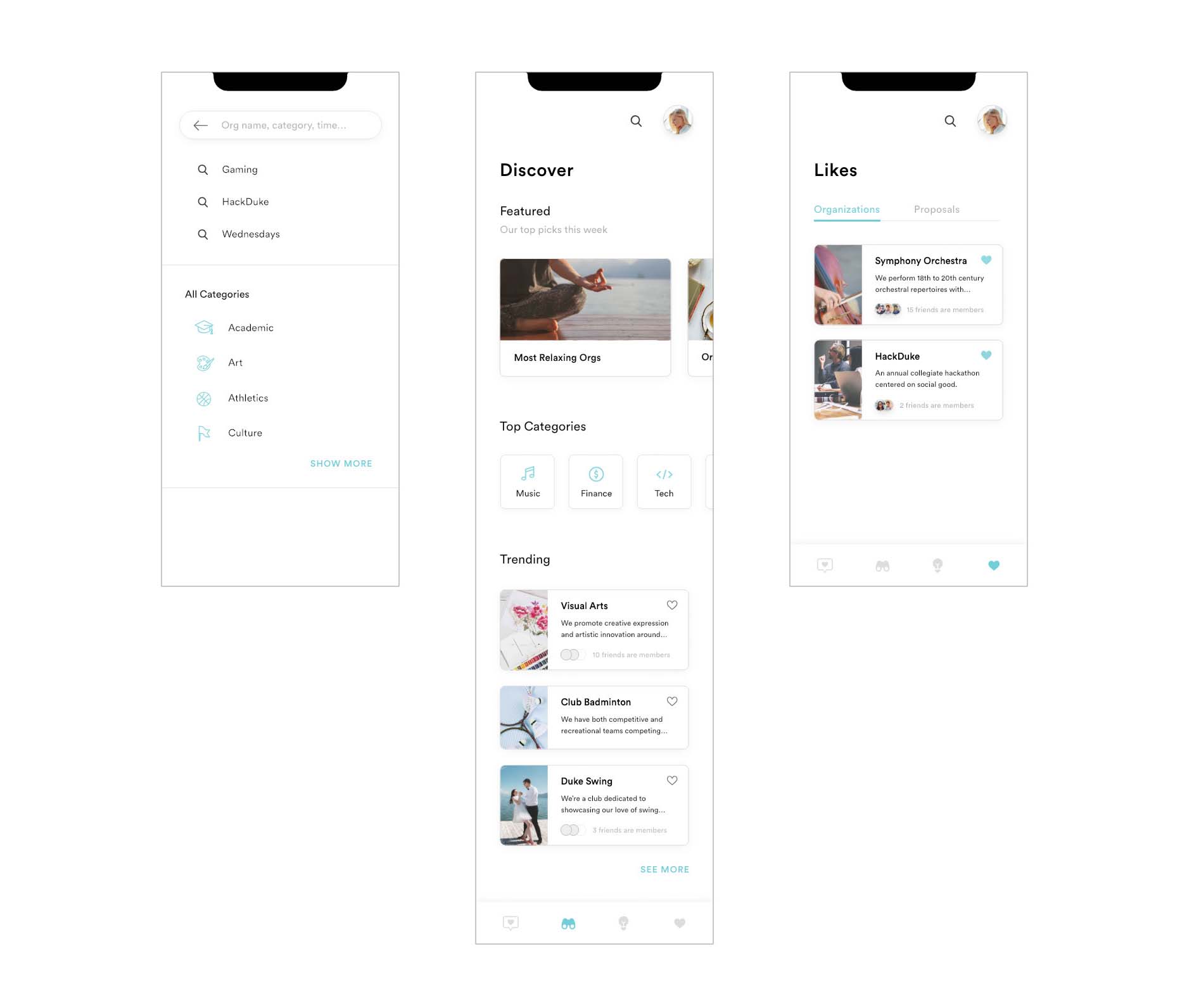
Discover has featured content
like curated collections and the top categories, both of which have horizontal scrolling with a sneak peek coming out to encourage more discovery/intrigue This section would help users find an org they might not have considered before.
Search lists all org categories
for easy searching and discovery. Likes has two tabs, one for existing orgs and one for proposals.
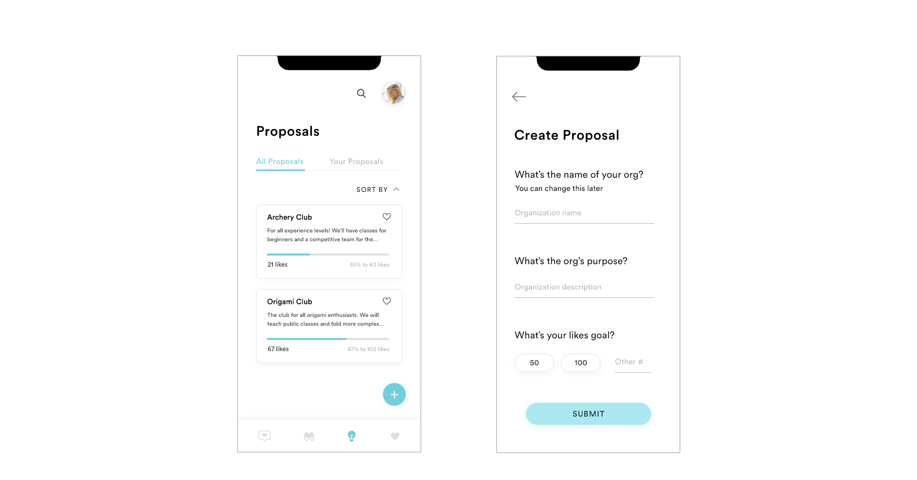
Proposals are given their own dedicated tab to draw user attention. Here,
users can see existing proposals and ones they've created.
There's a short summary of proposals and how many likes they have, as well as how close they are to their self-set goal before the org becomes a reality.
Users can also sort by percent completed or number of likes, etc. since that was shown to be most important to users.
From here, users can also answer 3 questions to make their own proposal. The questions are all put on one page instead of separate pages, unlike the sign up questionnaire because during testing, users preferred them to be on one page for this because the questions were short with answers that didn't require big buttons.
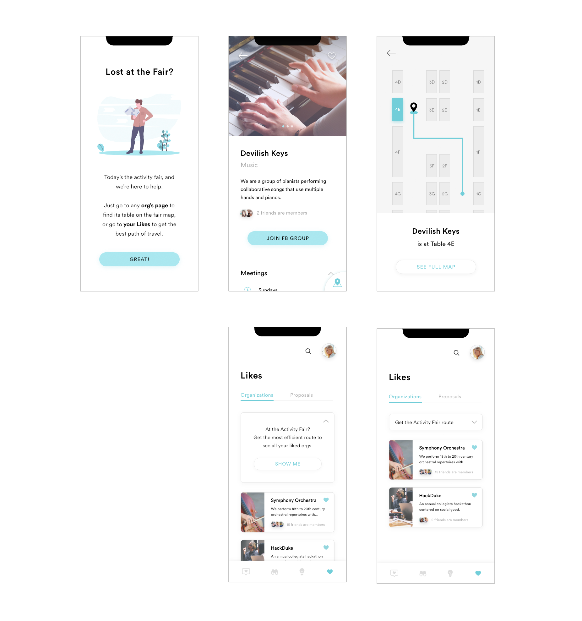
On the day of the activity fair, the app will have 2 new features to help students navigate the fair! The event can be really overwhelming since there's so many people and tables, but it's the most efficient way to find an org for students, so the app helps to make the experience smoother.
On an individual org page, clicking the expanding bottom sheet will
On the Likes tab, there will be a new collapsable card that gives users the ability to
On an individual org page, clicking the expanding bottom sheet will
open up a map showing how to get to the org's table
from where the user is (much like an interactive mall directory).
On the Likes tab, there will be a new collapsable card that gives users the ability to
chart the most efficient course through the Fair that hits upon every org in their Likes,
or as many as the users want.
Prototype
Future Features
In the future,
Adding more of a social aspect, like messaging, posting, or event creation would also be helpful (but would have to be done with care so it doesn't overlap too much with Facebook's current functionality).
adding a tablet version could be useful, especially for stationary tablets/kiosks
during the activity fair so students attending can more easily navigate the event if they don't have the app already.
Adding more of a social aspect, like messaging, posting, or event creation would also be helpful (but would have to be done with care so it doesn't overlap too much with Facebook's current functionality).
Thanks for reading!