September 2018
Steam Redesign Concept
Overview
Steam
is a popular gaming platform and marketplace that houses more than 15,000 games and is frequented by millions of users daily.
Since I really enjoy gaming, in my free time I took on improving the UI and UX of Steam's game page, which showcases key information like the game's description, media, reviews, and more.
Looking for my internship projects?
Check out my latest one here.
Problem
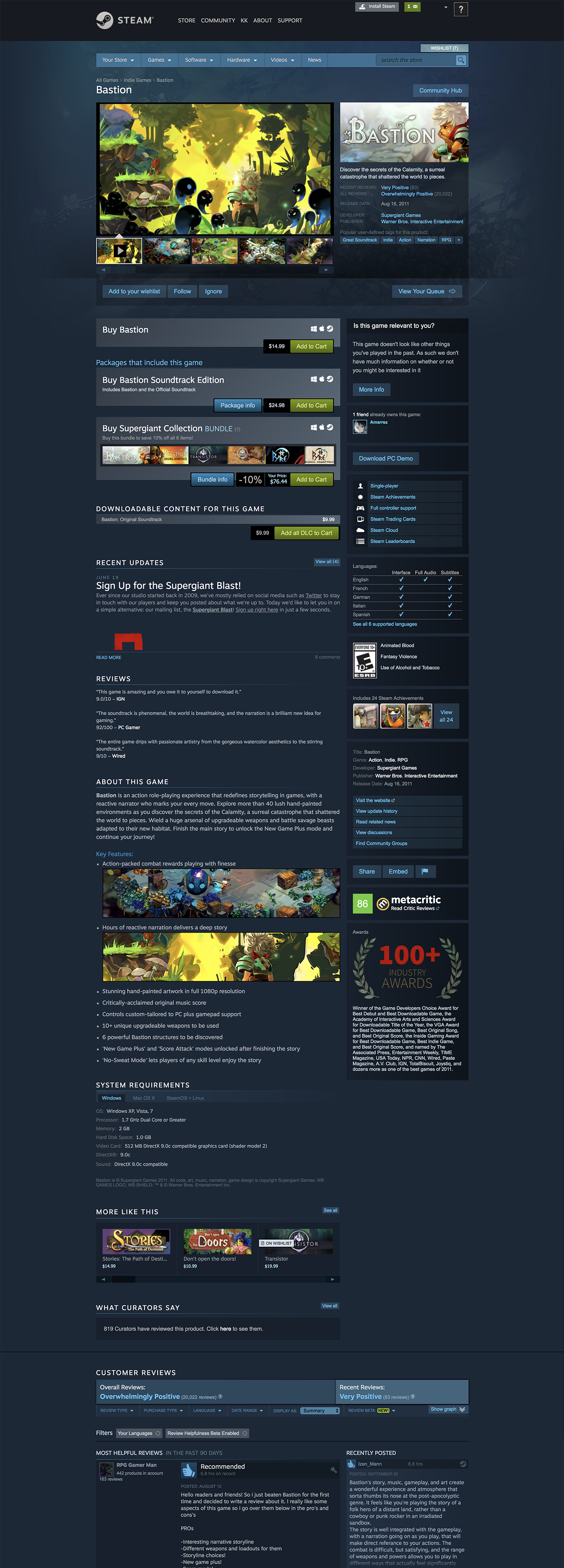
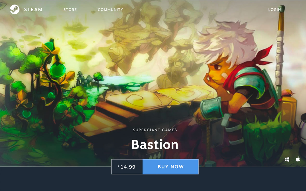
Steam's game page (below) overloads users with too much cluttered information.
The page is too long and disorganized--e.g. reviews from critics like IGN and Metacritic are in two different places.
As a gamer myself, I was always overwhelmed by Steam and found myself not using it very often because of all the disorganized information. I found this to be particularly unfortunate since Steam is a marketplace for games with interesting art direction and cutting edge gameplay, and I felt like the site paled in comparison.
Research
To confirm the problem was experienced by other users, not just myself, I sent out an initial questionnaire to friends, family, and Duke's gaming club. I asked questions about what they liked and didn't like about the Steam website, what they found most important to see on the game page, and more.
Their responses confirmed the problem, boiling down to
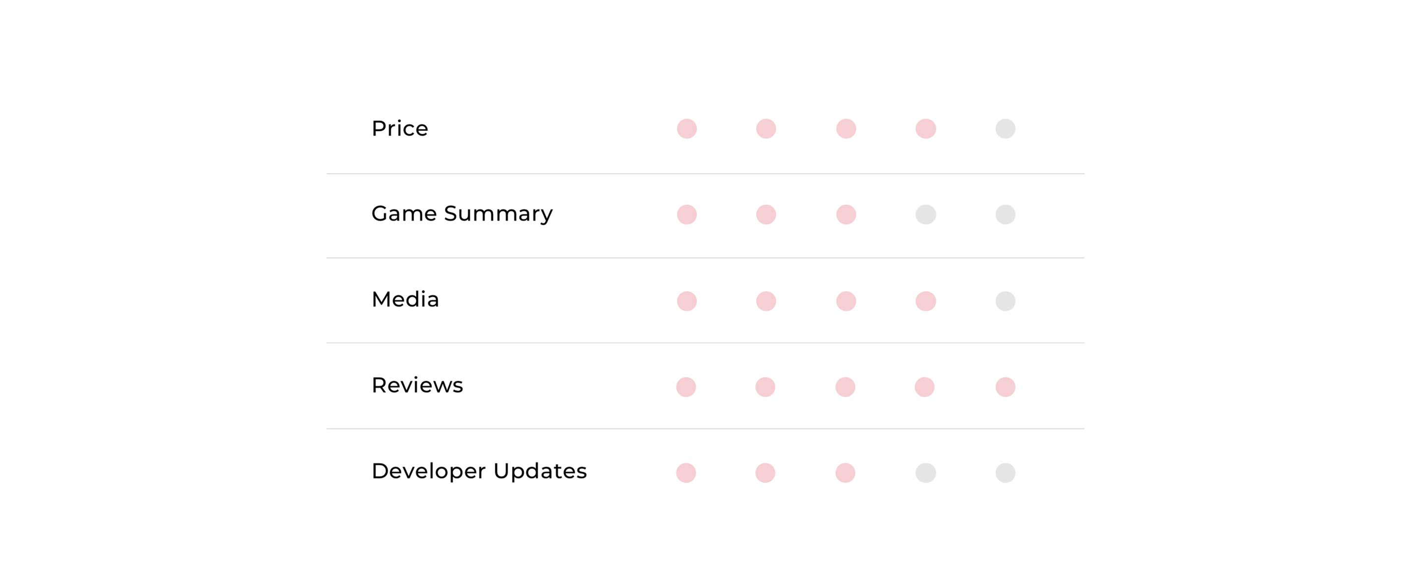
Besides this, respondents rated how important different parts of the page were to them out of 5. This helped me prioritize the right things when designing the new layout! The rating that got the most votes for each main category is below, but occasionally the answers were conflicted; for developer updates, a sizable number also rated them as 1 or 2/5.
Their responses confirmed the problem, boiling down to
"the site is clunky and impossible to navigate,"
as one respondent wrote.
Besides this, respondents rated how important different parts of the page were to them out of 5. This helped me prioritize the right things when designing the new layout! The rating that got the most votes for each main category is below, but occasionally the answers were conflicted; for developer updates, a sizable number also rated them as 1 or 2/5.
Users
From the questionnaire answers, I found that respondents fell into different categories of users:
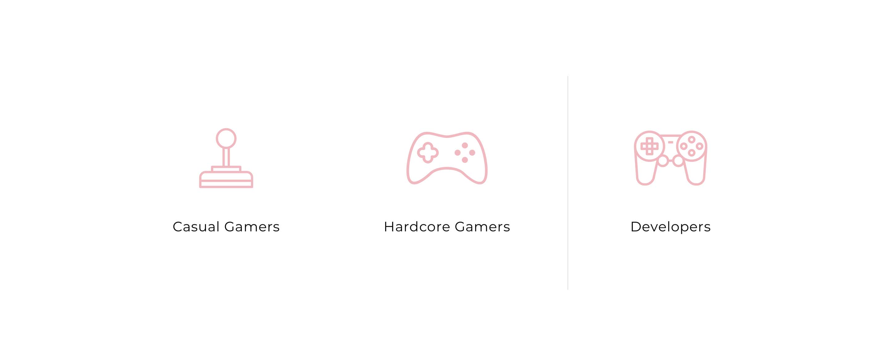
"Casual" players
seemed to focus on whether the game was good based on reviews, whether it was playable on their operating systems, what extra downloadable content was available, etc.
"Hardcore" players
wanted to know more of the technical details, like system requirements, as well as developer updates/game patch notes.
However, I realized there was also a third category of users that was unrepresented in my survey.
The game developers and publishers
put their games up on Steam's marketplace, and for some, selling games is their livelihood. They publish game information, graphics, and more to pitch their games to potential buyers, and they also can read reviews for feedback. They end up using the platform just as much as players do!
Goals
From my research, I came up with 2 goals to focus on in my redesign:
1.
Visually update
the site to be more aesthetically pleasing and more digestible, with less scrolling!
2.
Meet all stakeholders' needs
and keep them happy as much as possible. This includes all the users outlined previously, but also Steam as a business. Steam is the marketplace that allows all this interaction to happen, so it needs to stay afloat through successful marketing of their products.
Ideation
Sketching
I started with pen and paper sketches to quickly experiment with different layouts:
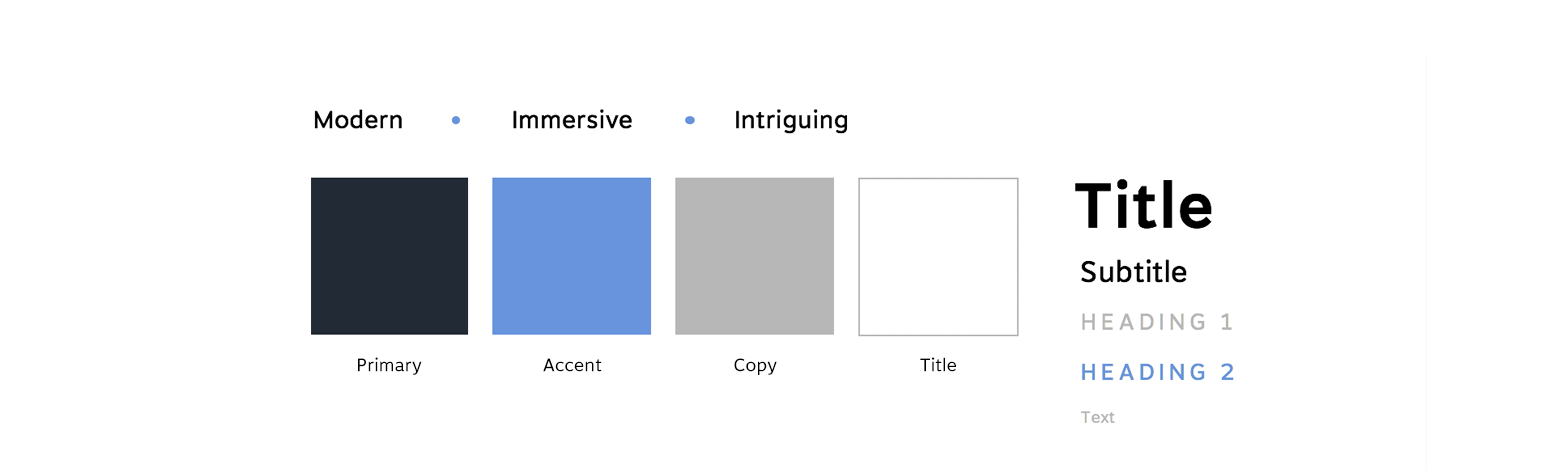
Style Guide
For the styling of the redesign, I brainstormed a couple of adjectives to use as inspiration: modern, immersive, and intriguing, to match the innovative games it showcases and the captivating worlds the games will bring players to!
I also kept some of Steam’s original styling, like their dark theme and font, Motiva Sans, to maintain the brand they’ve had over the years. To add to that, most users said they preferred dark theme to light theme in the survey. Some said it helped with long term readability, and it's helpful for gamers who are staring at their comptuers for such long periods of time.
I also kept some of Steam’s original styling, like their dark theme and font, Motiva Sans, to maintain the brand they’ve had over the years. To add to that, most users said they preferred dark theme to light theme in the survey. Some said it helped with long term readability, and it's helpful for gamers who are staring at their comptuers for such long periods of time.
Iterations
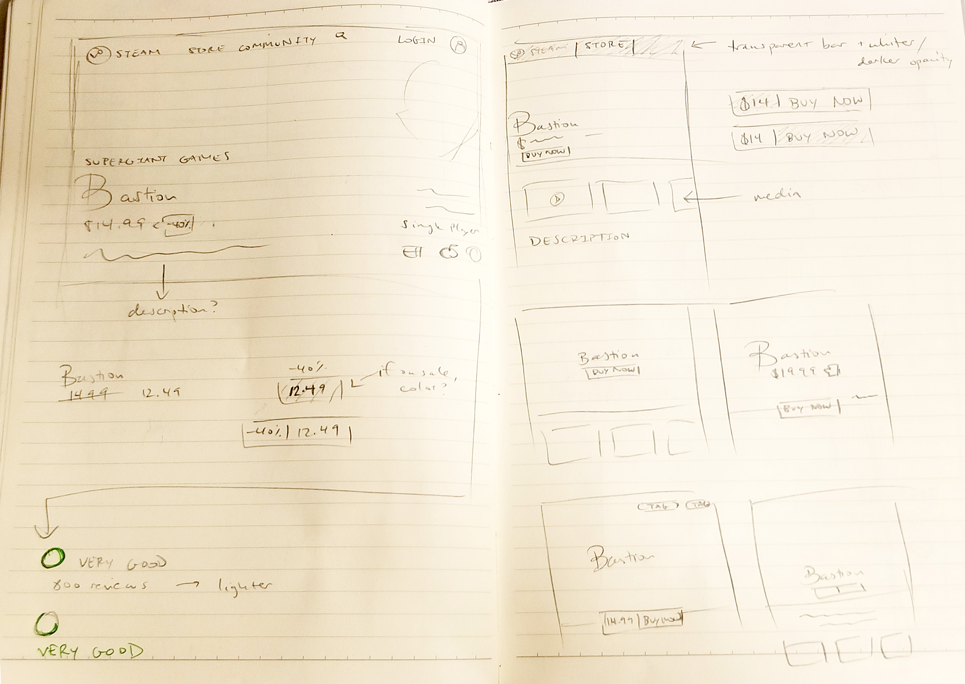
I spent the most time iterating on the layout of the hero image and the reviews, using the data from the initial research survey and A/B testing (in the case of the reviews) to narrow them down to the final design.
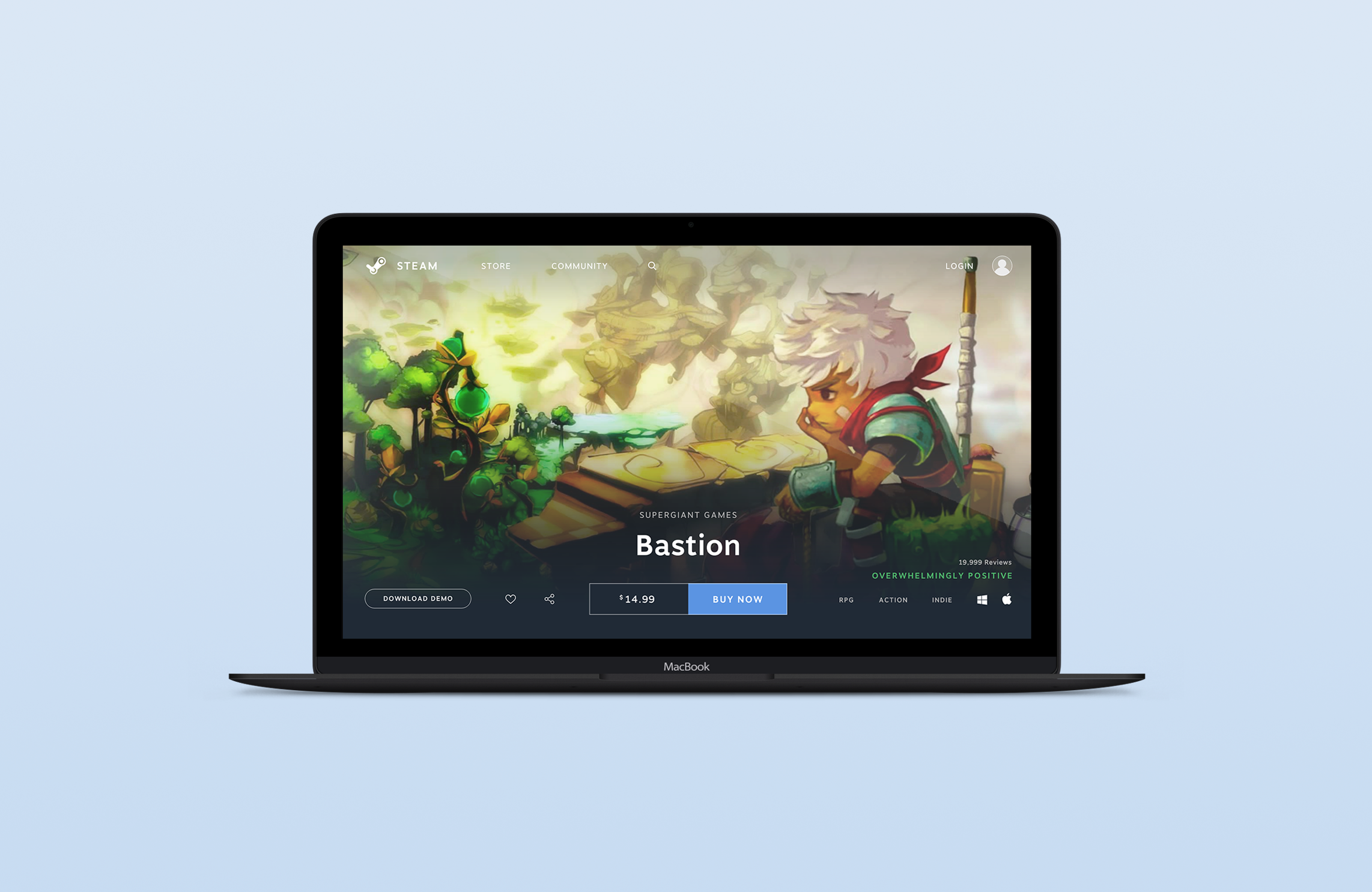
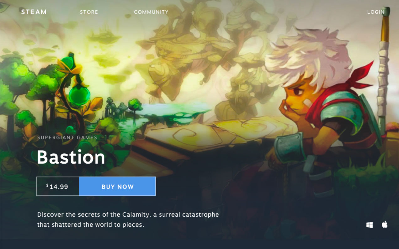
Hero Image
I played with several different layouts for where to put the key information over the hero image, which I wanted to highlight. There were so many different ways to approach it: using a gradient or a hard separator to transition between sections, putting the information on the bottom or the left, etc!
Iteration #1
- Although I liked how the eye flowed from key information on the left to the visual on the right, the gradient takes up too much space over the hero image in order to make the text readable. This wouldn't allow the image to stand out as much, because it would be relegated to just the right half of the screen.
Iteration #2
- This iteration took up less space in the image than Iteration #1, but the vertical stacking of information was still intrusive. I liked the bottom gradient transitioning between the sections here over the straight line present in Iteration #3 because I felt it was smoother and made the experience more immersive, however.
I then realized that left-aligned layouts like #1 and #2 wouldn't work with other images. Bastion has a right-aligned image, so using this kind of layout keeps the header visually balanced.
But using any other image with a center or right focus wouldn't have the same effect, and it isn't very fair to force developers to use a right-aligned image for all of their games.
Ultimately, I settled with a spin off of Iteration #3.
Iteration #3
- I moved the game description to a section below and centered the title, with other key information in the left and right corners. In the final version, I made the price and buy buttons the same width for symmetry and because they have the same weight in priority. 
Iteration #1
Iteration #2
Iteration #3
Reviews
Surprisingly, user feedback was very divided on how to represent reviews.
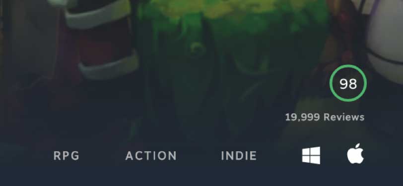
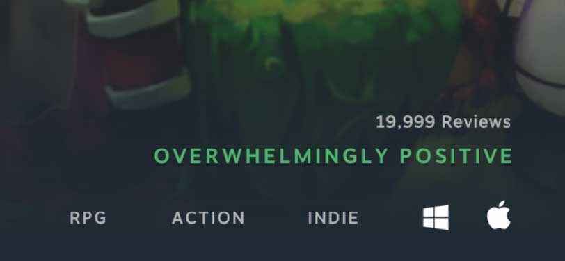
Steam currently represents reviews as Recommended or Not Recommended instead of a typical 5 star rating. Based on what percent of reviews are Recommended, Steam attaches a review summary of positive, very positive, overwhelmingly positive, etc. I debated between representing this in a quantitative or qualitative manner.
Steam currently represents reviews as Recommended or Not Recommended instead of a typical 5 star rating. Based on what percent of reviews are Recommended, Steam attaches a review summary of positive, very positive, overwhelmingly positive, etc. I debated between representing this in a quantitative or qualitative manner.
Iteration #1
- I personally prefer quantitative data because I consider it to be more informative than words, which could be misleading, so I played with representing this review summary as the percent of Recommended reviews within a colored circle that would change colors depending on whether it was positive/mixed/negative. I iterated on different layouts for this, not pictured.
Iteration #2
- I also tried sticking with the qualitative system because it is currently what Steam uses.
Users were split around 50/50! Some were adamant about quantitative for the same reasons I was, but others said qualitative summaries made more of an impact, and the unique review system had become of Steam's identity over the years. Some also said they didn't understand what the circle meant.
I ultimately went with qualitative for consistency with the review system, but if users hover, they can see the quantitative version. This is Steam's current functionality, but since most users didn't know this was a function, I'd like to add a circle with a question mark to show hoverability in the future.
Iteration #1
Iteration #2
Prototype
Navigation Bar
I considered using either a black low opacity bar for the navigation bar or a gradient. I chose the gradient because it was smoother and more immersive--the same reason I went with the gradient for the header. Ideally, the nav bar would only appear on first load of the page and when the user hovers over the top of their page.
Header
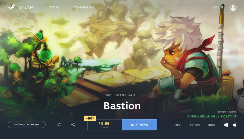
The header serves as the first impression players get of the game, so I focused on including the most valuable information according to users as well as making it as immersive as possible.
Ultimately, I grouped together actionable items in the bottom left corner and game descriptors like genre and review rating in the bottom right corner.
Pictured on left is the sale price, where I used yellow to make it stand out--Steam has sales often!
Users noted that they considered media, reviews, platforms, and price to be over 4/5 importance,
so they were placed prominently in the header, with the key game graphic being the star of the show. Highlighting the key game graphic and making the header 100% the size of the browser was also in an effort to build a more immersive experience.
Ultimately, I grouped together actionable items in the bottom left corner and game descriptors like genre and review rating in the bottom right corner.
Pictured on left is the sale price, where I used yellow to make it stand out--Steam has sales often!
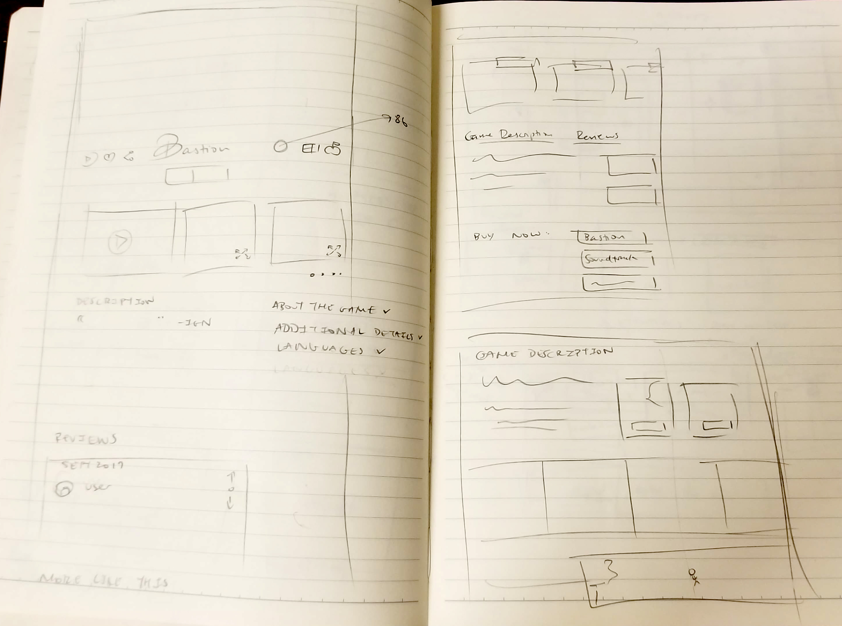
Tabs
A big problem that users had with Steam is the length of the page as well as its disorganization. While I can understand the appeal of not having to change pages, the page forces users to scroll for eons to find what they need, and the information is scattered.
Users also had varying opinions on what they wanted to see most on the page. Accommodating all these preferences, I used tabs to put every type of information on the same hierarchy so users can instantly navigate to what's most important to them.
Users also had varying opinions on what they wanted to see most on the page. Accommodating all these preferences, I used tabs to put every type of information on the same hierarchy so users can instantly navigate to what's most important to them.
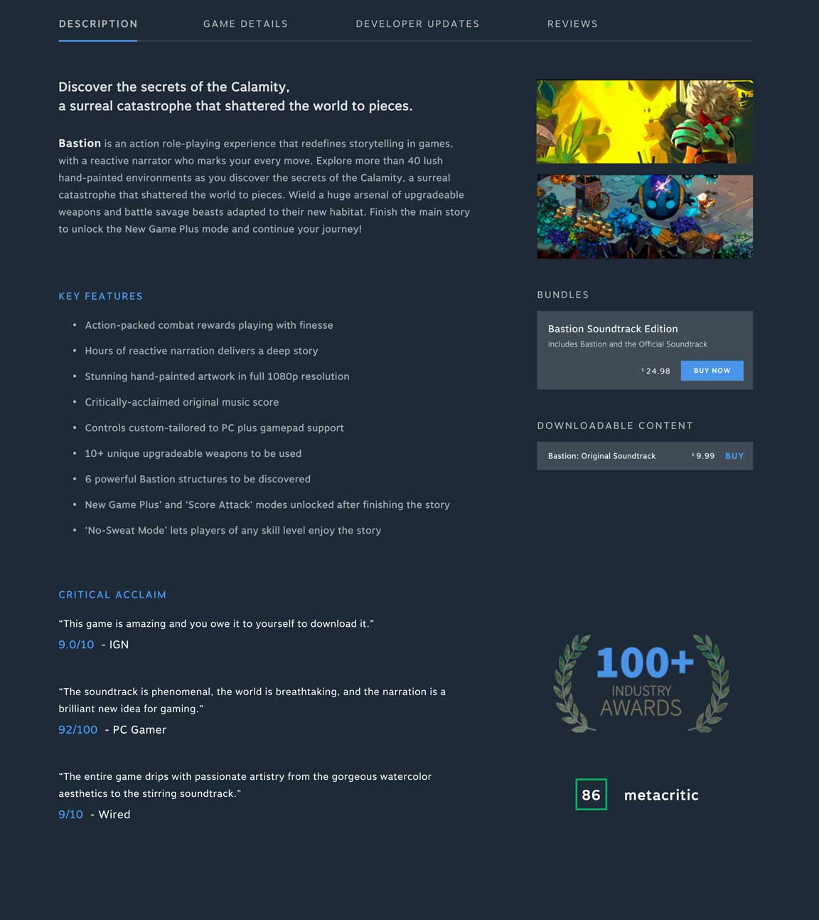
Description
Game description is the default open tab, so it’s a continuation of the first impression that players get to the game.
The current steam page has GIFs dispersed throughout the key features section, so I placed them next to the game summary so users who didn't watch the trailer can still see bits of the gameplay here.
Other purchasing options are placed in the right column, with game editions more prominent than downloadable content.
Reviews from reputable sources are also here as part of developers advertising their accolades and prominent good reviews. Users would be able to hover over the 100+ to see a list of awards.
It was really important to include valuable information here not only for the players to get a good gist of the game, but also for the developers to pitch their game.
The current steam page has GIFs dispersed throughout the key features section, so I placed them next to the game summary so users who didn't watch the trailer can still see bits of the gameplay here.
Other purchasing options are placed in the right column, with game editions more prominent than downloadable content.
Reviews from reputable sources are also here as part of developers advertising their accolades and prominent good reviews. Users would be able to hover over the 100+ to see a list of awards.
Developer Updates & Reviews
Developer Updates were considered solidly 3/5 in priority on my user research survey, but a fair share of users voted it as a 1 or 2/5--and that's how Steam currently represents it, with only half of the latest developer update visible in the store page. I thought developer updates deserved their own soapbox because they pour so much work into their game and might need to make important announcements to the players, so I provided a tab for them.
Reviews were simply updated stylistically to match developer updates and follow Steam's current rating system.
Reviews were simply updated stylistically to match developer updates and follow Steam's current rating system.
Future Features
In the future, I'd like to add a lot of the
features that Steam currently has,
like Community Hub, as well as a way for videos to play in the header,
and a place for the game logo to go.
Steam is a robust website with a lot of features, and my current design doesn't allow for some additional aspects that can help show off a game's charm!
Thanks for reading!